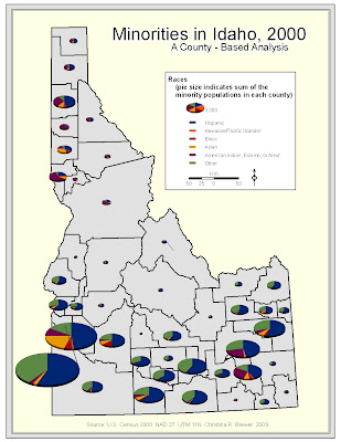
The following map is a pie chart map of Idaho showing some of the minority racial composition of each county. Pie slice shows the percentage of each race; whole pie size shows the sum of the minorities in each county. The data shows a larger quantity of these minorities in southern Idaho.
This map is somewhat limited in the placement of pie symbols. I would have liked to easily place them more nicely. Some smaller value pies' slices are not very discernable. Also, I would have liked to break the pies into a proportional, or graduaded symbol scheme in the legend.

Population Density & Elderly Populations
The following map shows elderly population in Idaho counties using graduated symbols. County population density is portrayed in darkening shades of blue (county background). The map shows a higher number of elderly in the south and northwest portions of the state. The map shows some counties with low population density, but higher numbers of elderly. This may be partially due to density being a function of county size.
The map is limited in the fact that it does not display elderly density, but rather raw quantities. This map give a deceptive picture of the percentage of elderly in each county.


No comments:
Post a Comment