Wednesday, April 22, 2009

Map of the Week - National Public Lands Day

This weeks map is not a hard copy map so much as it is an interactive tool.
The National Public Lands Day web site contains a simple map of the U.S. Clicking on a state will do two things: tell you that state does not contain any sites, or direct the browser to a new page containing information about public lands day sites in that state. The info includes thing such as contact phone number, related website, directions, and a link to a locational map. Perhaps quite a useful tool for those interested in being involved with National Public Lands Day.
Please the following link to see this week's interactive map of the week.

http://www.publiclandsday.org/involved/sites.htm?

Exercise 7
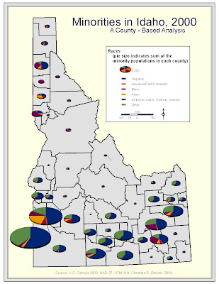
Minority Racial Composition
The following map is a pie chart map of Idaho showing some of the minority racial composition of each county. Pie slice shows the percentage of each race; whole pie size shows the sum of the minorities in each county. The data shows a larger quantity of these minorities in southern Idaho.
This map is somewhat limited in the placement of pie symbols. I would have liked to easily place them more nicely. Some smaller value pies' slices are not very discernable. Also, I would have liked to break the pies into a proportional, or graduaded symbol scheme in the legend.

Population Density & Elderly Populations

The following map shows elderly population in Idaho counties using graduated symbols. County population density is portrayed in darkening shades of blue (county background). The map shows a higher number of elderly in the south and northwest portions of the state. The map shows some counties with low population density, but higher numbers of elderly. This may be partially due to density being a function of county size.

The map is limited in the fact that it does not display elderly density, but rather raw quantities. This map give a deceptive picture of the percentage of elderly in each county.

Wednesday, April 15, 2009

Map of the Week - Wood?
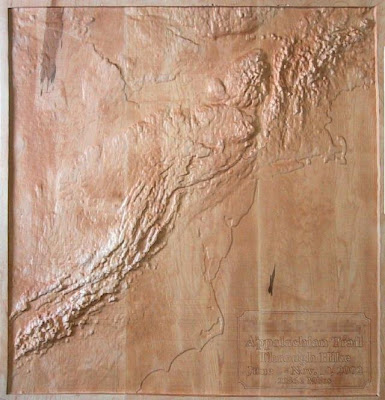
This week's map is somewhat unconventional, but we see many ordinary maps . . . why not display some uncommon cartogaphic efforts.

How about a map made of wood.

Check is out, a relief map carved in wood. This particular map shows the appalachian mountain range of the eastern U.S. It's kinda like the east's rocky mountains, but much shorter.

The map is suppose to depict the appalachian trail, which makes it's way from Georgia (in the south) to Maine (in the north), however, the trail could be better labeled (maybe a wood burning instrument), as well as state boundaries.

I would recommend viewing this map with a similar view from GoogleEarth. Some prominent land features: Cape Hatteras, and Cape Lookout (North Carolina), and Cape Cod (Mass.).


Source: http://www.cbsled.com/relief_maps.html

Exercise 6

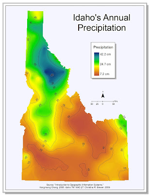
Annual Precipitation - inverse distance weighting
This map shows annual precipitation throughout Idaho. The map clearly shows lower values in southern Idaho.
I chose to symbolize the background in a way that hopefully communicates the subject matter, but also conveys trends across the landscape. I also added a light grey background, which can help to keep Idaho from fading into a sea of white.
Although I would have liked to include the year of the data the year was not provided. I experienced trouble with the legend. I would have liked to make is a horizontal color ramp, but all attempts were thwarted. I also had some trouble with the contour labels. I still think that there might be too many labels. Intropolation method was that given in lab intructions: inverse distance weighting.

Annual Precipitation - Kriging
This map also shows annual precipitation in Idaho. However, the interpolation is creating using kriging, rather than inverse distance weighting as before.
The overall trends are still intact, but perhaps with less detail.
For this map I chose to stick with my layout from the previous map. I was somewhat pleased with that layout and repeat layout use can speed the cartographic process. The man thing that is different in this map is the contour labeling. I went with the same basic styling, but made more effort to align labels in succession at certain locations. I believe that this may help to give the second map a cleaner appearance than the first map.

Tuesday, April 7, 2009

Excercise 5

Minorities in Idaho
The map layout is somewhat simple in color with some smaller embellishments (legend drop shadow, subdued N. arrow, title masking). I experienced some trouble in working with the legend and related dots for label boxes. I changed the project to a state plane that seemed to better portray the state of Idaho.


Capital City Populations
For this map I decided to leave the legend is frameless, perhaps helping to more closely associate symbols with features. The north arrow is more decorative than my typical choice but perhaps more typical of global mapping. Map elements were used to help sort of frame the globe (legend, credits, N. arrow). I experienced some trouble due to my inexperience with graduated symbol mapping.

Hawaiian & Pacific Islanders, Buffalo NY.
In this map I made use of some color, and a more decorative symbol for the proportional map symbol of this map. I did experienced some trouble in setting up proportional symbols partially due to my lack of experience in this area of map making.

Monday, April 6, 2009

Map of the Week - Lechuguilla Cave
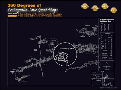
Humans create maps of so many land features. However, few tend to realize that there is much to map below the surface.


Caves are not something new. There's Mammoth Cave, the world's largest with the corresponding N.P. in Kentucky. The western U.S. boasts Cathedral Caverns, the interior of which exhibits many impressive cave formations while the main toursit entrance hosts mass bat flights around dusk. Wind Cave is another notable "hole in the ground".


One such cave truly does lie relatively low from public view. Lechuguilla.


This week's map is a rendering of this cave. Lechuguilla, unlike the previously mentioned tourist caves, is somewhat preserved, and restricted to regular tourist visits. Entrance is only granted to specific individuals, sometimes scientists studying a cave that has been spared.


The given map is a glimpse of a package of software allowing users to view details and extent of mapped passages. Please see the main web site for further info. http://www.360parks.com/lechuguilla_cave_virtual_tour.shtml
Cave surveyers and/or cartographers use some map symbols that may be unfamilar to many land mappers. Please take note of the legend.

http://images.google.com/imgres?imgurl=http://www.360parks.com/previews/lechuguilla_quad_map.jpg&imgrefurl=http://www.360parks.com/lechuguilla_cave_maps.shtml&usg=__4pD525aKvyvSEYM0SrdAzQz8igw=&h=763&w=1021&sz=92&hl=en&start=2&um=1&tbnid=E6auTCSQq5Mz6M:&tbnh=112&tbnw=150&prev=/images%3Fq%3Dlechuguilla%2Bmap%26hl%3Den%26um%3D1