This weeks map of the week comes from Portland, Maine. Below is an image of the map. However, it is better viewed from the source web site where is can be enlarged and more closely inspected.
http://www.sullboat.com/portland%201876%20birds%20view_m.jpg
The Map
This work is of Portland Maine from a "bird's eye view," showing the city from a side angle. The streets are labeled and various eastablishments numbered with indentification in the lists below the main map. This was published in 1876 as the workmanship of Jos. Warner.
Tuesday, March 31, 2009
Maps – Originals Re-Invented
A Word About The Blog Layout
This post contains orginal and revised maps from geovisualization exercises 1 through 3.
The first part of each section contains a heading followed by a bit of info about that two maps to follow. The first map is the orginal version followed by a list of some, or all of the aspects of the original map that were changed. The last item in each section is a copy of the revised map.
Please feel free to post comments and questions. Enjoy!
Race Dominance, Buffalo
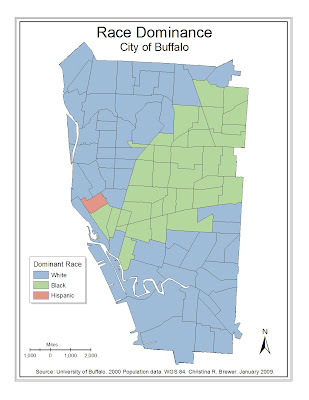
The following two maps depict dominant races in land tracts of Buffalo. The first map was the originally submitted version. The map is somewhat satisfactory in this form. However, the second map includes additional edits, hopefully improving the map in depicting the qualitative phenomenon of race dominance. I attempted, but failed to properly project the layers. I was able to define the layer’s geographic coordinate system.
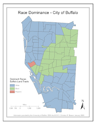 Changes
Neatlines
Title - appearance
Legend - Title, frame, and text and object sizes
Scale bar – Thicker, and unit more centered over zero
North arrow – reduced size
Credits – Edited
 Changes
I wanted to make this map look more child-like since it depicted school age children values.
Area between two neatline – added blue background
Title – edited phrasing and masking color
Legend – Background color, created color ramping, removed “%” from labels (it’s in the title).
Scale bar – reduced size and line thickness, more centered unit title.
North arrow – Edited masking
Credits – Edited
Background – Color change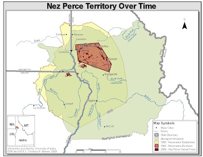
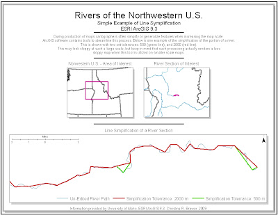 Changes
Neatline – Reduced gap between each, and added a background color
Legend – changed position and format, perhaps making it more visible at a quick glance
Scale bar – added to insets and increased length in main map
North arrow – added to insets
Credits – moved up a little
Insets – edited attention color, now perhaps better matching with the map
 Changes
The edited map was altered in ArcMap by added the jpg and working within the ArcGIS environment.
Neatline – added
Labels – added to Indian Peaks Wilderness, and dealt with “Highway” below the feature.
Credits – added a small credit
 Changes
Titles – Changed the font to Times New Romans. I believe this creates a better look to the map.
Scale bar – Reduced size, and more centered the unit title
North arrow – moved down, and left a little
Credits – Moved down a little
Projection – Alber’s Equal Area Conic is an improvement from the previous. However, the scale bar showed that something was wrong with the projection. Tried, but did not get it fixed.
This post contains orginal and revised maps from geovisualization exercises 1 through 3.
The first part of each section contains a heading followed by a bit of info about that two maps to follow. The first map is the orginal version followed by a list of some, or all of the aspects of the original map that were changed. The last item in each section is a copy of the revised map.
Please feel free to post comments and questions. Enjoy!
Race Dominance, Buffalo
The following two maps depict dominant races in land tracts of Buffalo. The first map was the originally submitted version. The map is somewhat satisfactory in this form. However, the second map includes additional edits, hopefully improving the map in depicting the qualitative phenomenon of race dominance. I attempted, but failed to properly project the layers. I was able to define the layer’s geographic coordinate system.
 Changes
Neatlines
Title - appearance
Legend - Title, frame, and text and object sizes
Scale bar – Thicker, and unit more centered over zero
North arrow – reduced size
Credits – Edited

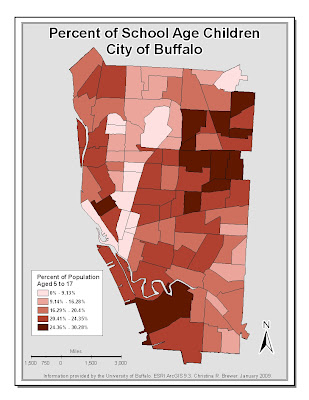
Percent of School Age Children, Buffalo
The next two maps depict population distribution of individuals 5 to 17. These children may, or may not be enrolled in school. We can say, however, that they are within the school age group in the U.S. This is the same layer used in the previous maps, and is also not properly projected.
The next two maps depict population distribution of individuals 5 to 17. These children may, or may not be enrolled in school. We can say, however, that they are within the school age group in the U.S. This is the same layer used in the previous maps, and is also not properly projected.
 Changes
I wanted to make this map look more child-like since it depicted school age children values.
Area between two neatline – added blue background
Title – edited phrasing and masking color
Legend – Background color, created color ramping, removed “%” from labels (it’s in the title).
Scale bar – reduced size and line thickness, more centered unit title.
North arrow – Edited masking
Credits – Edited
Background – Color change
Nez Perce Territory
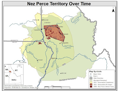
The following two maps show the shrinkage of Nez Perce reservation lands beginning with the aboriginal land up to the 1863 borders, as well as land ownership in 2006.
The following two maps show the shrinkage of Nez Perce reservation lands beginning with the aboriginal land up to the 1863 borders, as well as land ownership in 2006.

Changes
Title – Changed the mask color, removed bold font
Scale bar – added to inset
North arrow – reduced and moved further into the upper right corner, also added one to the inset
Credits – Edited
Inset – Refocused extent
Title – Changed the mask color, removed bold font
Scale bar – added to inset
North arrow – reduced and moved further into the upper right corner, also added one to the inset
Credits – Edited
Inset – Refocused extent

Rivers, an Example of Line Simplification
The following two maps are examples of ArcGIS’s capability to simplify lines for cartographic, or other mapping purposes. The map shows the river of interest both regionally, semi- locally, and also close up.
The following two maps are examples of ArcGIS’s capability to simplify lines for cartographic, or other mapping purposes. The map shows the river of interest both regionally, semi- locally, and also close up.
 Changes
Neatline – Reduced gap between each, and added a background color
Legend – changed position and format, perhaps making it more visible at a quick glance
Scale bar – added to insets and increased length in main map
North arrow – added to insets
Credits – moved up a little
Insets – edited attention color, now perhaps better matching with the map
Boulder Area, Boulder, Colorado
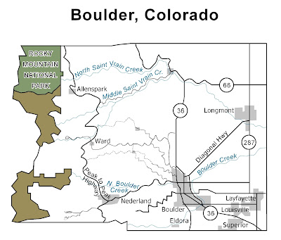
This first map was created using Macromedia Freehand software. The map lacks many of the important map elements, such as a legend, scale, and north arrow. Freehand is not a geographically interfaced software. The first map was created with some attempts to adhere to the given lab directions with less attention to my personal map design preference.
This first map was created using Macromedia Freehand software. The map lacks many of the important map elements, such as a legend, scale, and north arrow. Freehand is not a geographically interfaced software. The first map was created with some attempts to adhere to the given lab directions with less attention to my personal map design preference.
 Changes
The edited map was altered in ArcMap by added the jpg and working within the ArcGIS environment.
Neatline – added
Labels – added to Indian Peaks Wilderness, and dealt with “Highway” below the feature.
Credits – added a small credit
Average Family Size
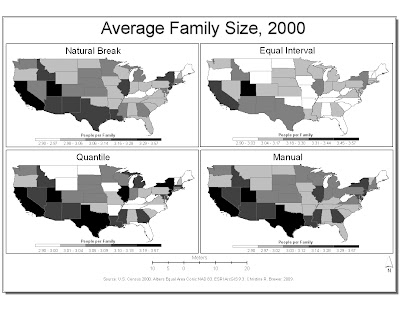
The following two maps depict average family size within each state using four different methods for classifying data. Five classes were used for each map.
The following two maps depict average family size within each state using four different methods for classifying data. Five classes were used for each map.
 Changes
Titles – Changed the font to Times New Romans. I believe this creates a better look to the map.
Scale bar – Reduced size, and more centered the unit title
North arrow – moved down, and left a little
Credits – Moved down a little
Projection – Alber’s Equal Area Conic is an improvement from the previous. However, the scale bar showed that something was wrong with the projection. Tried, but did not get it fixed.
Subscribe to:
Comments (Atom)


